top of page

2024
Co-Lab logo
Co-Lab is a collaborative initiative by the University of Salford, integrating teaching, research, and technology to advance education. It focuses on accessibility, digital wellbeing, and immersive technologies like AR and VR to shape the future of learning.
Branding &
Visual Identity
Marketing & Promotion
Logo
Client /
UoS Co-Lab
The goal was to convey a sense of fluidity and a futuristic outlook, aligning with the customer’s preference for a minimalistic and modern approach over traditional styles. Designs that incorporate a simple yet bold/dramatic aesthetic were explored, emphasizing innovation and a forward-thinking identity.

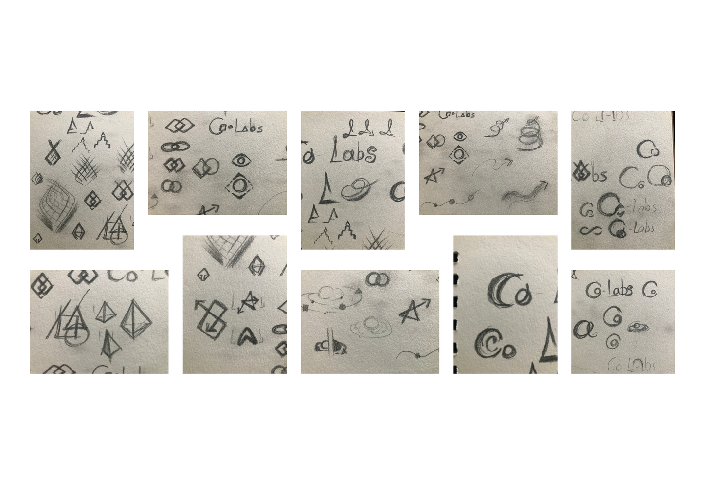
As part of the logo creation process for Co-Lab, I explored numerous sketches, refining ideas to highlight the most impactful concepts.


The final designs incorporated the University of Salford’s signature red for consistency and used Replica Pro font to align with the University’s branding.
Bold text was selected for added emphasis and drama.

The client wanted to have adaptable formats: one featuring just the ‘C’ within a circle and another with the full name, providing flexibility for different applications.


Co-Lab previously operated under the main University of Salford visual identity. I had the opportunity to design a logo for them, giving them their own distinct branding.
bottom of page