2025
On The Rocks
The challenge was to reimagine an SGS spirit as a non-alcoholic offering with its own brand identity including brand activation.
Branding &
Visual Identity
Marketing & Promotion
Packaging
Client /
Suntory Global Spirits & Design Bridge & Partners In collaboration with Sharan Sethi
D&AD New Blood Challenge
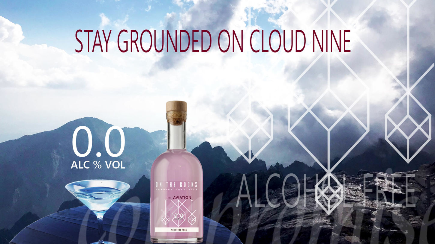
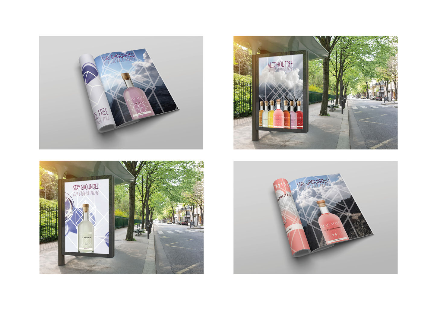
The concept revolves around a pure, airy drink symbolizing the clarity and lightness of a clear mind, achieved through the absence of alcohol. Inspired by the brand name ‘On The Rocks’, the visual identity incorporates imagery of rocky mountains alongside the ethereal qualities of light clouds against a bright blue sky. The reflective surfaces of the glassware further emphasize clarity and joy, weaving these elements into a cohesive visual narrative that embodies lightness, purity, and an uplifting spirit.
Symbolically, “clarity” represents not just the purity of design but also the idea of enjoying the same drink experience with a clear mind, aligning with the alcohol-free concept. White, chosen as a central element of the brand identity, evokes “purity, simplicity, and elegance”, encapsulating the ethos of lightness and mindfulness.
This thoughtful approach ties the brand narrative together: ‘light and pure’ drinks, symbolizing a clear head and elevated experience, ‘free from compromise’.

Colour choices:
The decision to use white colour on the label was intentional, emphasizing versatility and refinement. White harmonizes effortlessly with any bottle color, offering a neutral yet premium backdrop that enhances the vibrancy of the drink itself. A clear label further reinforces this flexibility, showcasing the colourful beverages while avoiding visual clutter that might detract from their sophistication.
Instagram Posts:


Interpretations of
current rhombus logo
Through variations in size, orientation, and subtle design tweaks, the goal is to refresh and evolve the logo while maintaining visual coherence and recognition. These new iterations aim to offer a modern, dynamic take on the original design, aligning it with current design trends while preserving its core identity.
Symbolically, “clarity” represents not just the purity of design but also the idea of enjoying the same drink experience with a clear mind, aligning with the alcohol-free concept. White, chosen as a central element of the brand identity, evokes “purity, simplicity, and elegance”, encapsulating the ethos of lightness and mindfulness.
This thoughtful approach ties the brand narrative together: ‘light and pure’ drinks, symbolizing a clear head and elevated experience, ‘free from compromise’.


